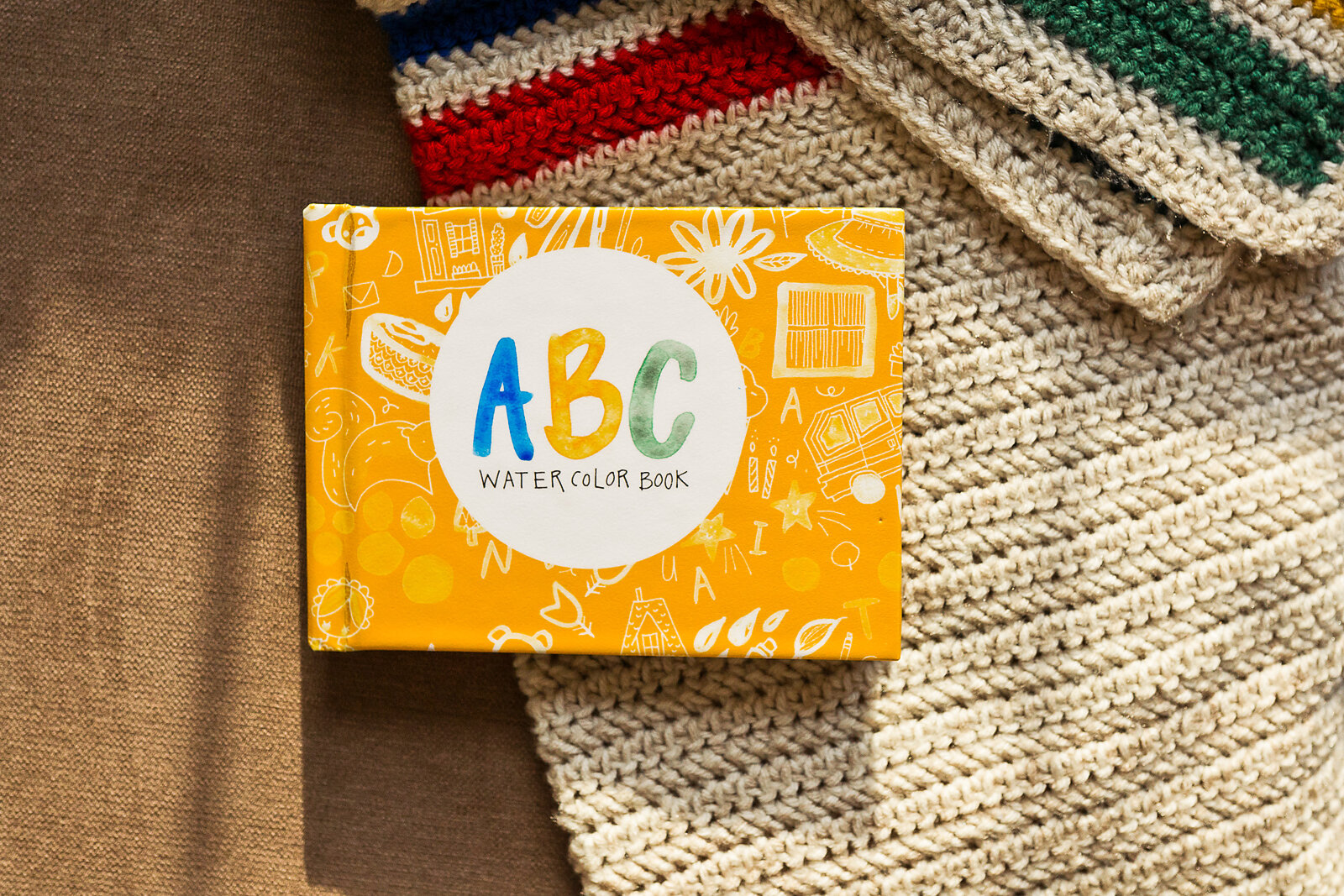
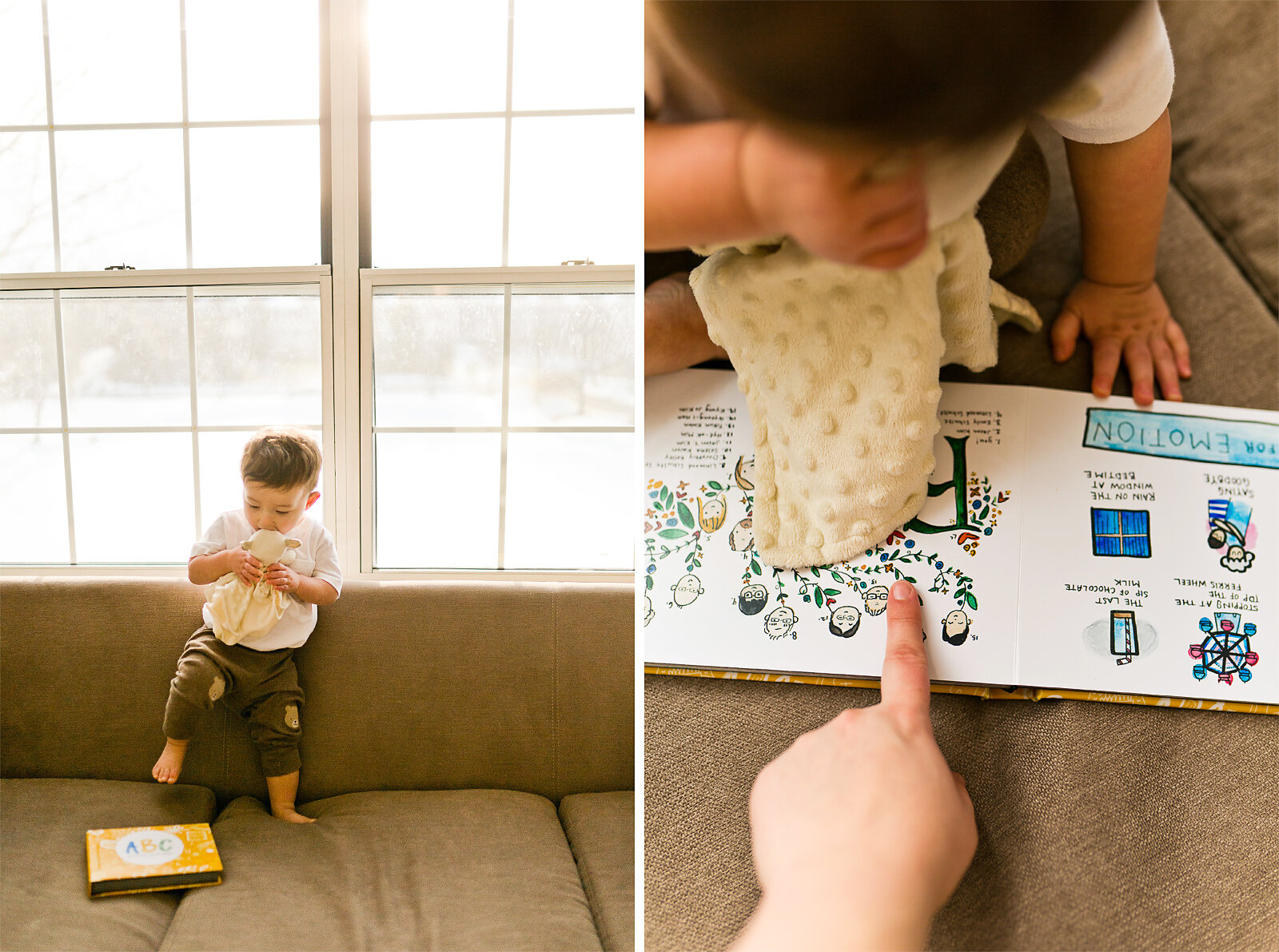
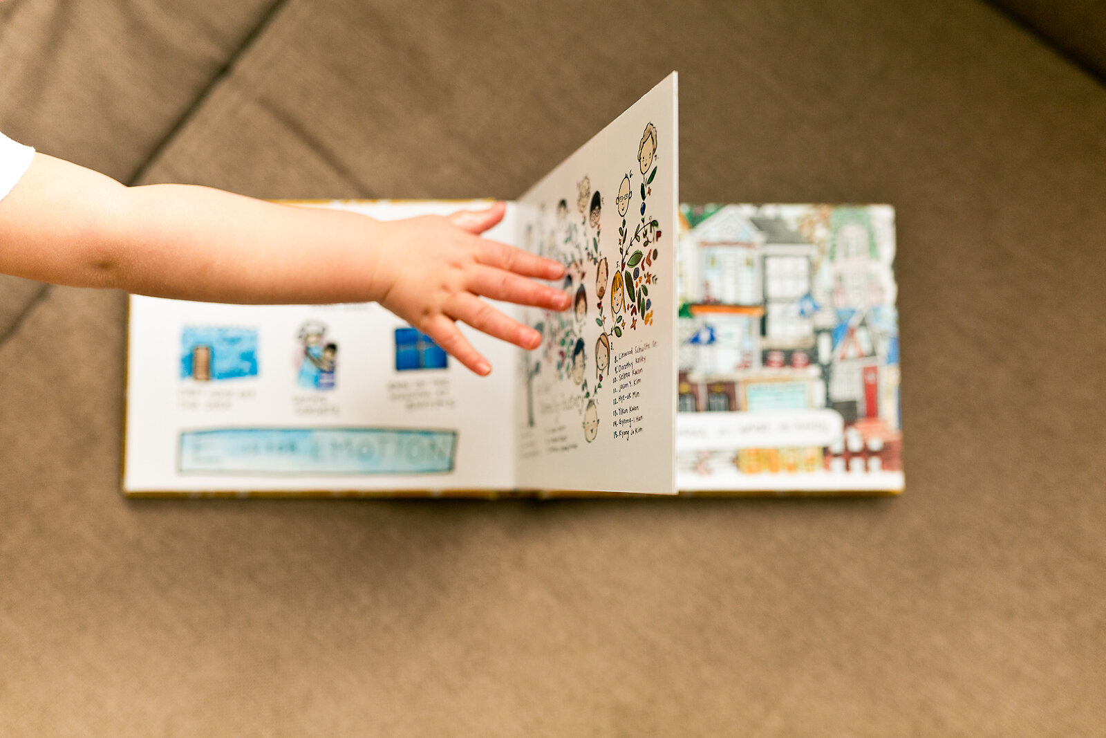
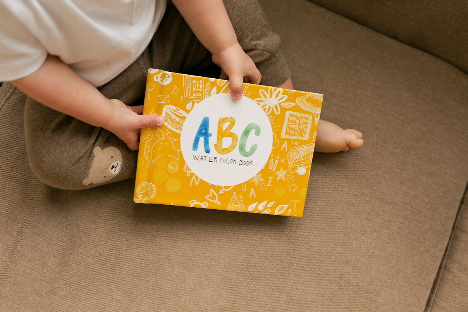
I made a watercolor ABC board book! And it took forever, because the alphabet has TWENTY SIX LETTERS and having to choose just one(!) word for each of those letters made me incredibly indecisive.
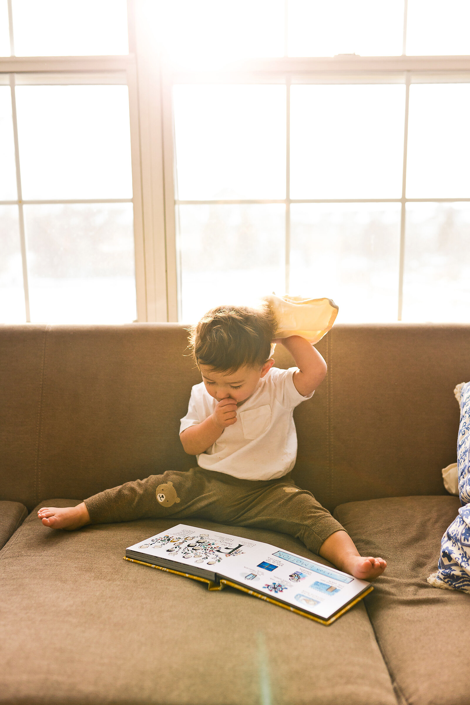
I printed the book just like I’d print a photo album. This one in particular is through ZNO because it’s on the affordable end and they offer these rigid pages that are crucial if you ever actually want to trust your baby to handle the book themselves. Printing as a photo album is significantly more expensive than a regular ol’ board book you’d find in the infant section at Barnes & Noble, but it was important to me that the image/color quality was just as good as a photo print and in the end - you’re paying for the value of giving your child an experience completely unique to them.
My number one piece of advice for doing any sort of custom book project like this is to truly make it AS CUSTOM AS POSSIBLE. You think I’m gonna fork out that money to print an ABC book where I paint pictures of “A is for apple” and “B is for ball”?? That would be dumb, because I could go over to the infant section at Barnes & Noble and find that for $6.99. Make the pages about you and your family and use all the tiny details you can to make it unique.
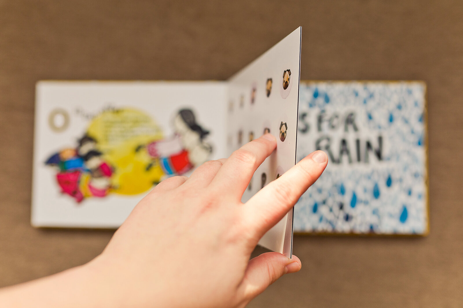
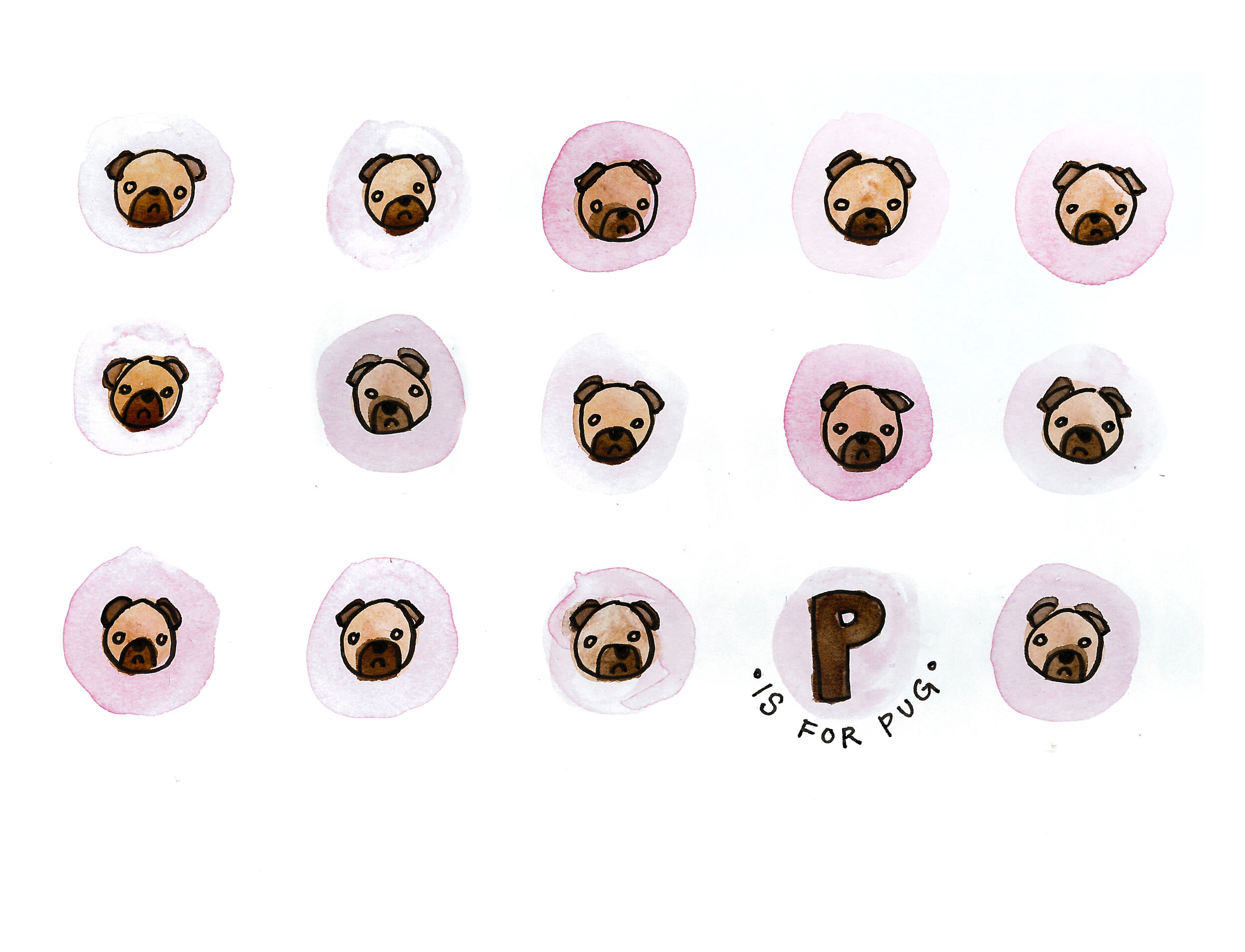
P is for pug because they’re one of my all time favorite animals.
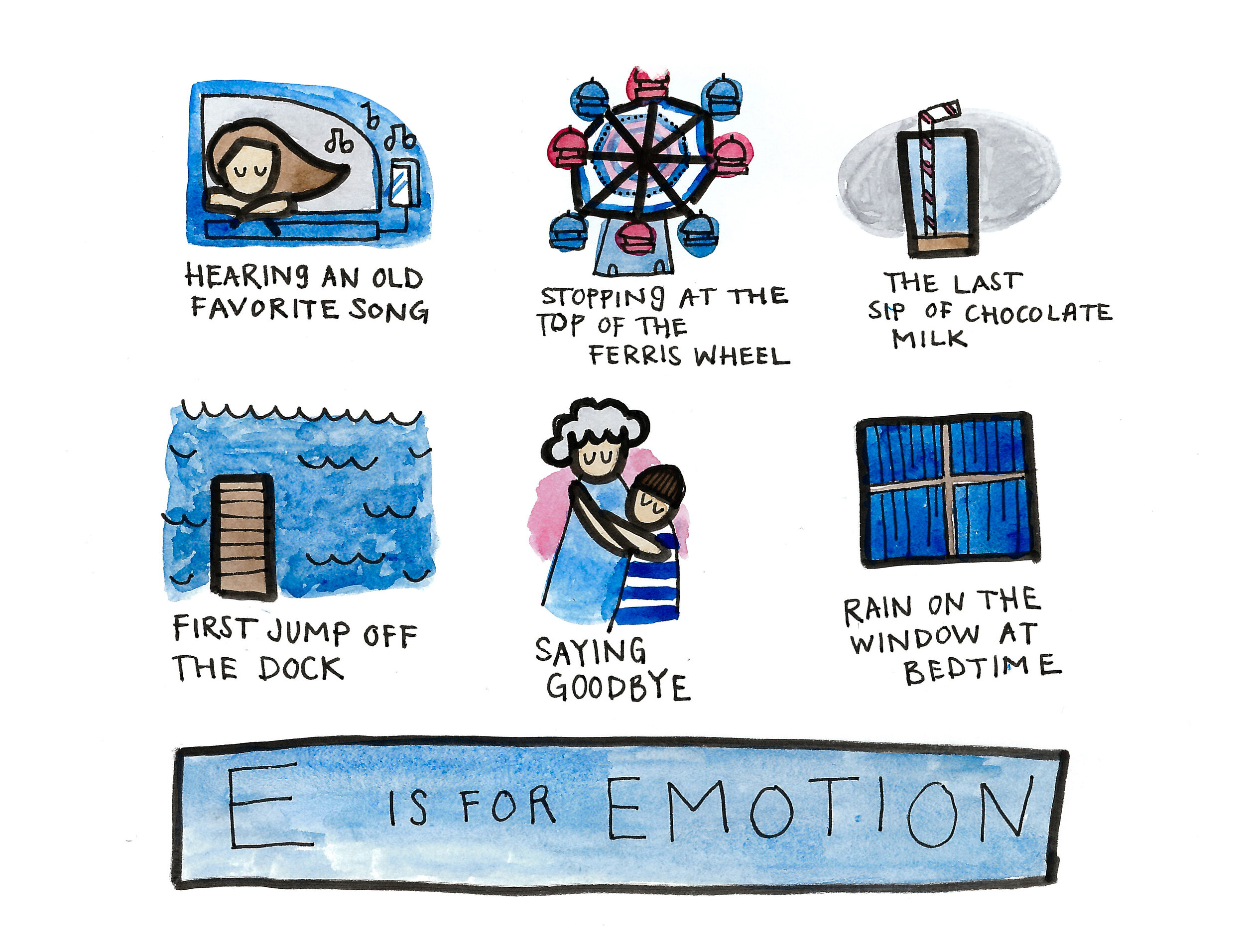
E is for emotion because I am passionate that my children understand beyond HAPPY and SAD. So many experiences we have will entangle both and it isn’t bad to feel sad. Hopefully this doodle will illustrate that to them a little bit.
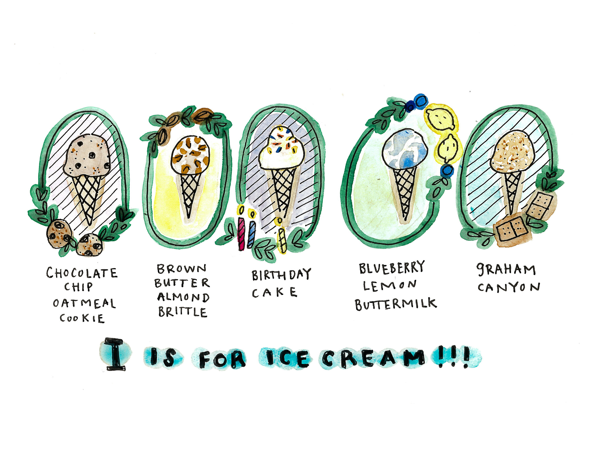
I is for ice cream! Each of these flavors represents a favorite ice cream from one place or another. Chocolate chip oatmeal cookie was the flavor we had on our first trip to Seattle a few years ago at Molly Moon’s. It was so good we went back for it again the next day! Graham Canyon is the iconic flavor of the BYU Creamery and it really is the absolute best. I miss that stuff.
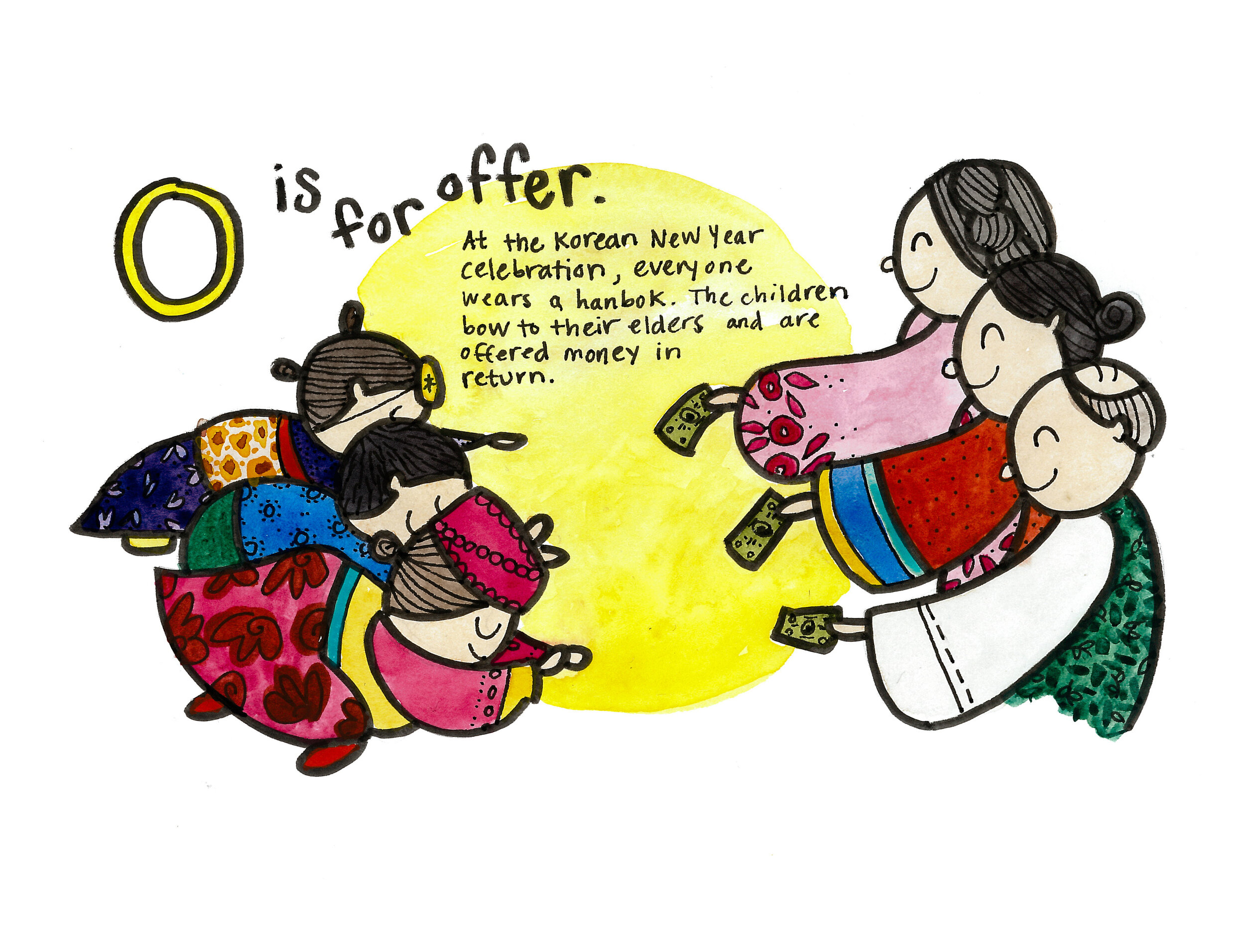
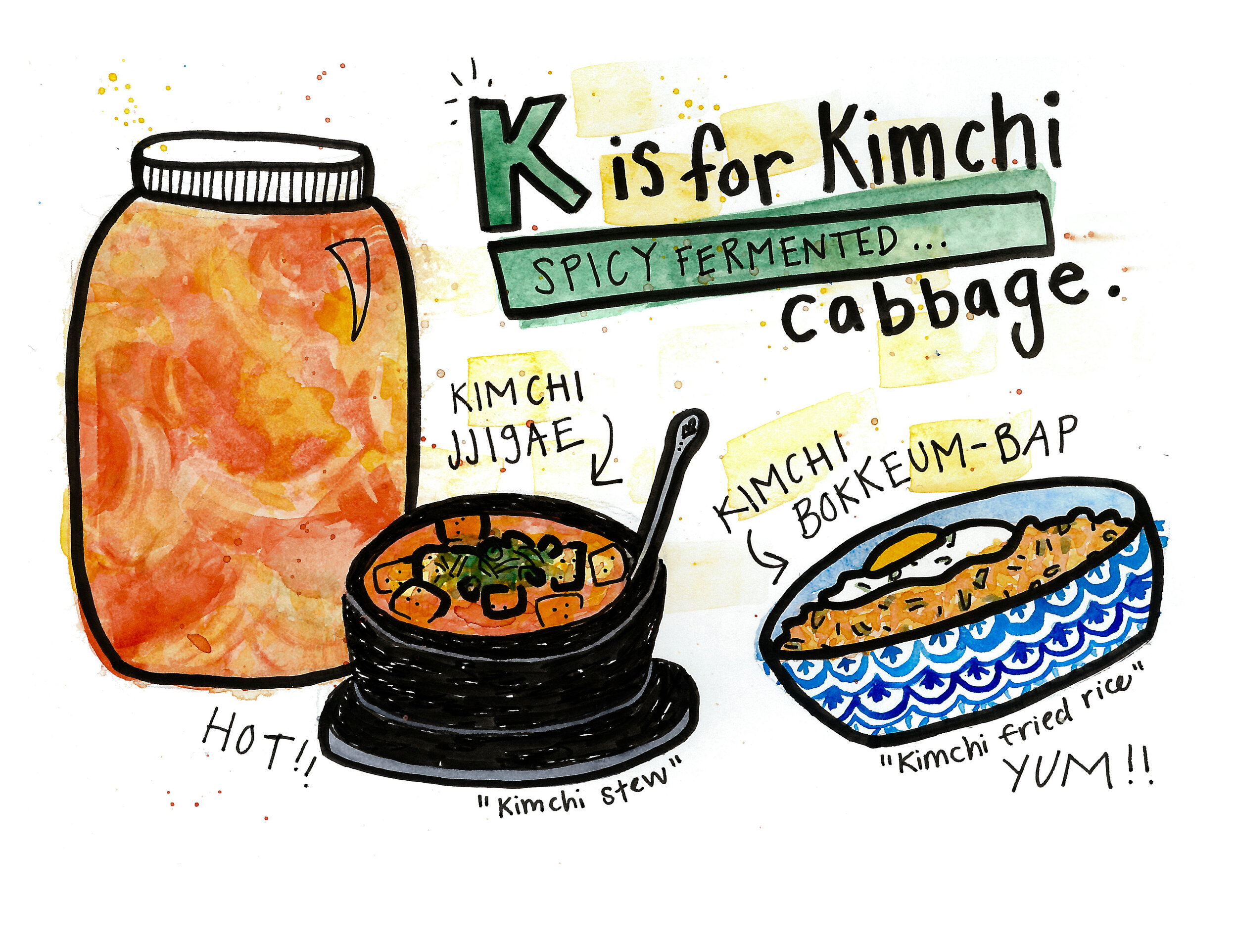
O is for offer and K is for kimchi. Many pages I chose to teach something about our children’s heritage. And I just love how colorful these ones turned out!!
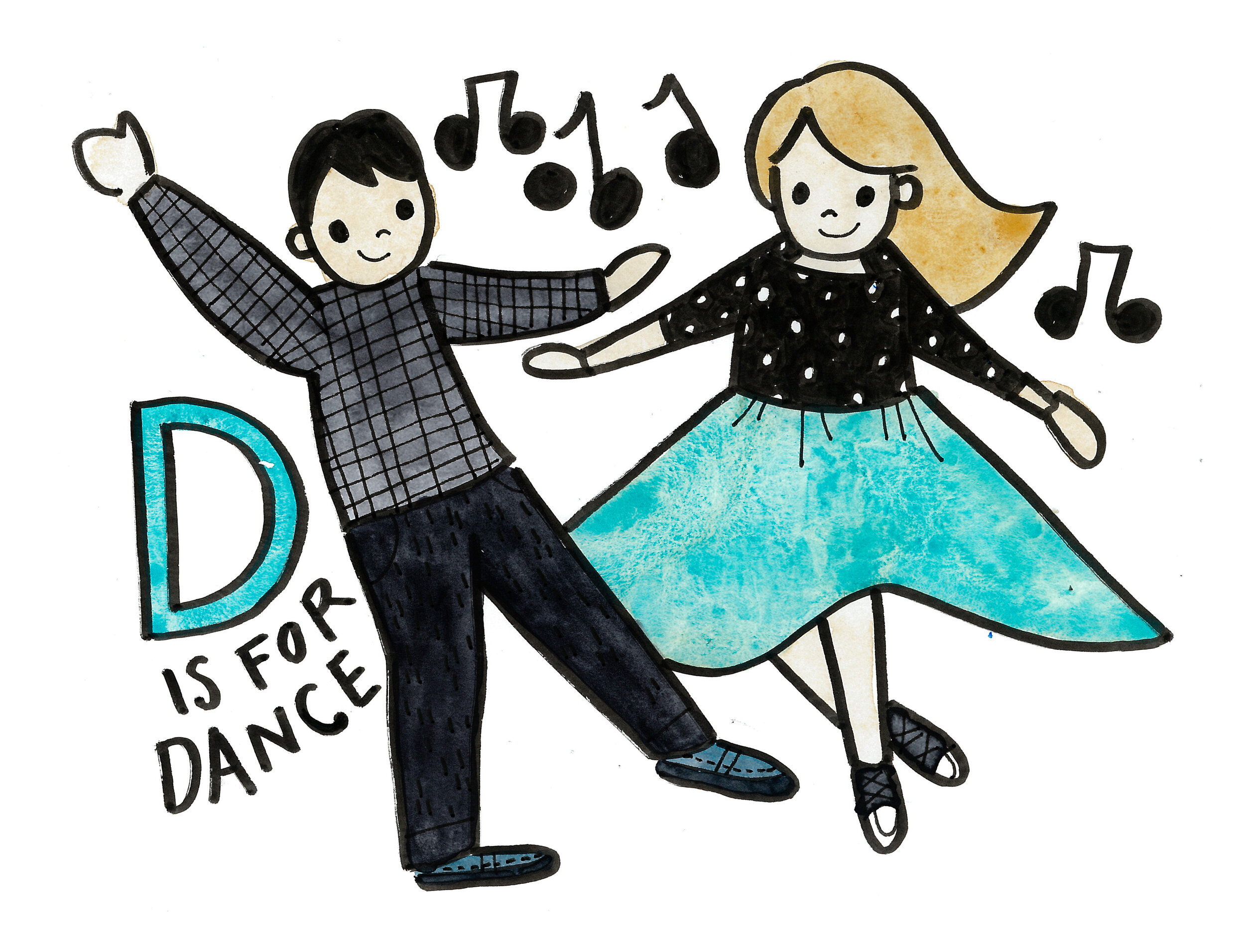
D is for dancing! Cue the cute because this one depicts how we first met - these are actually the outfits we were wearing! This is an important detail because the only reason Jason asked me to dance was because I had a (truly amazing) circle skirt on flared out so big on the swing dance floor. It caught his attention and here we are.
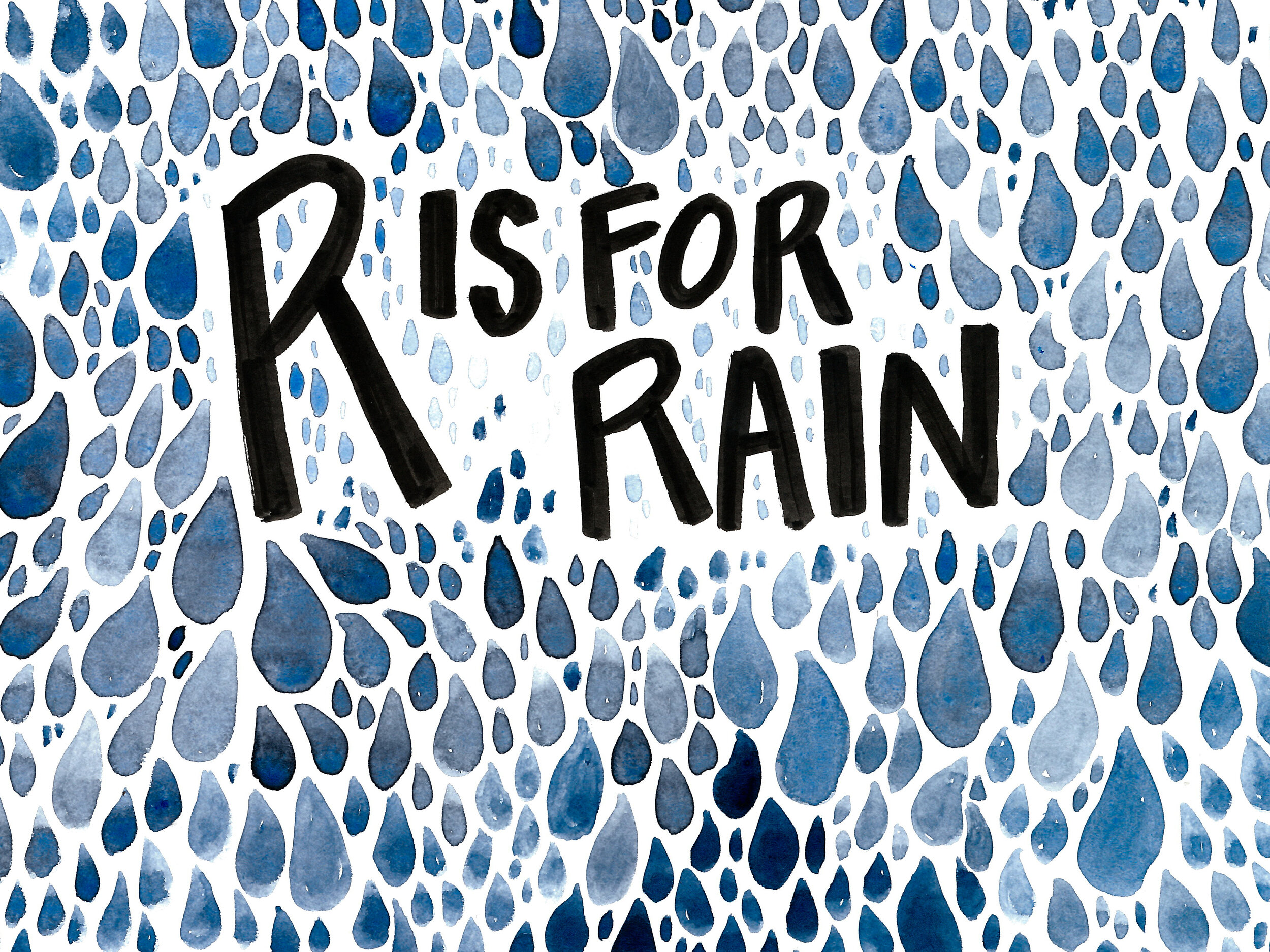
R is for rain. Obviously!!
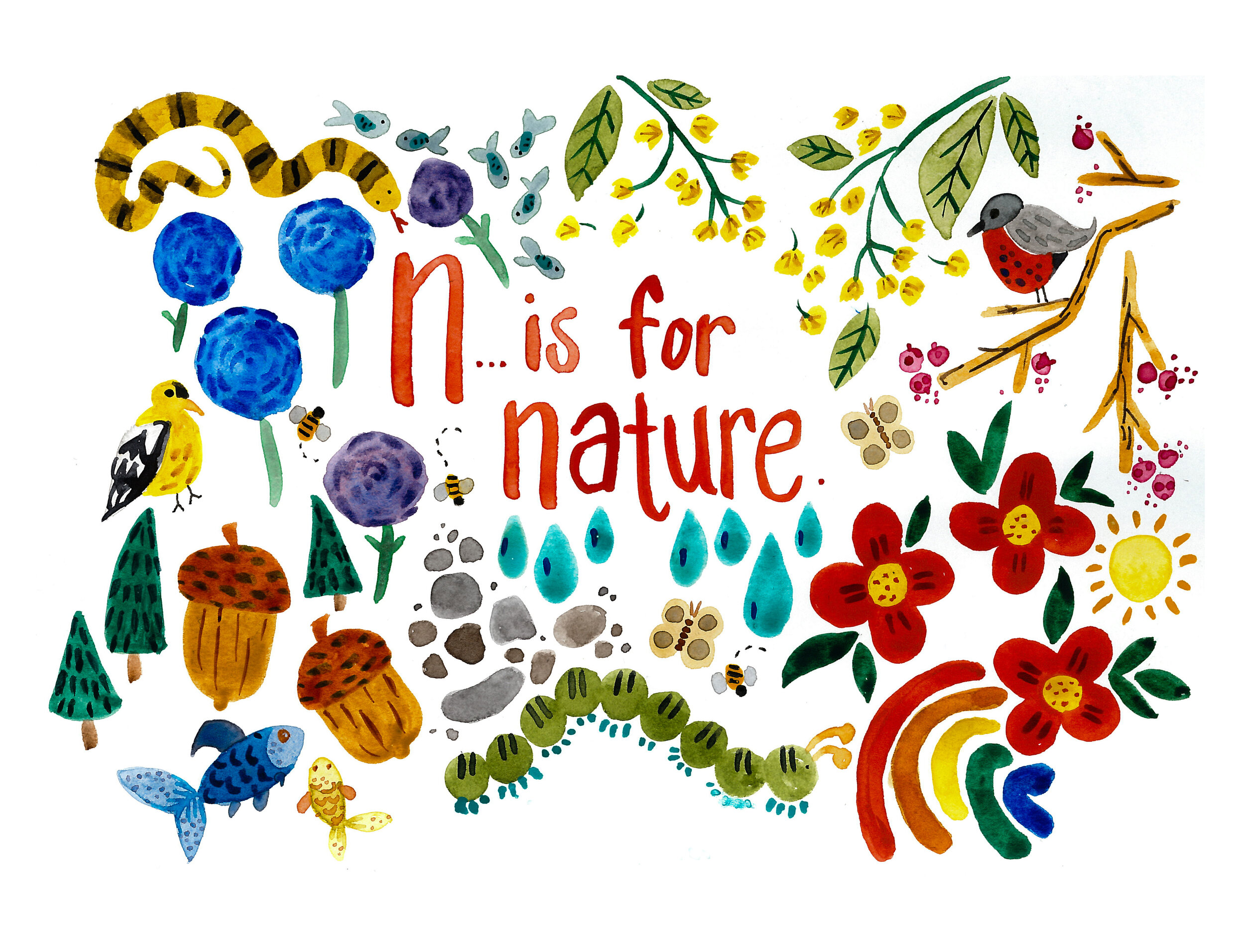
N is for nature. Obviously!! This one turned out to be my most favorite of the whole book. It made me want to go back and redo all the rest to have the “no black outline” style but that would be way too much work. Oh well!
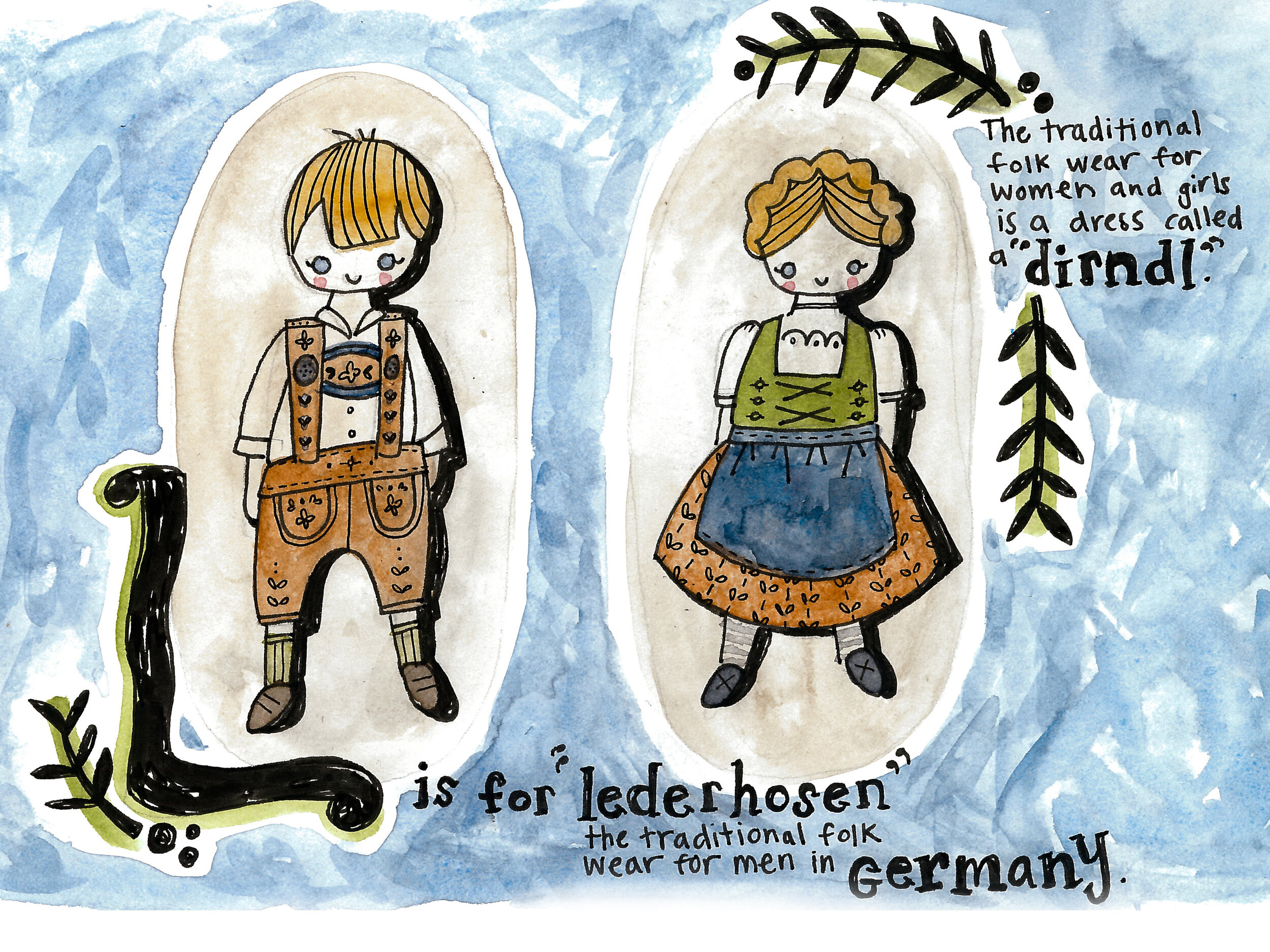
L is for lederhosen. Again, putting some family heritage in there whenever I can!
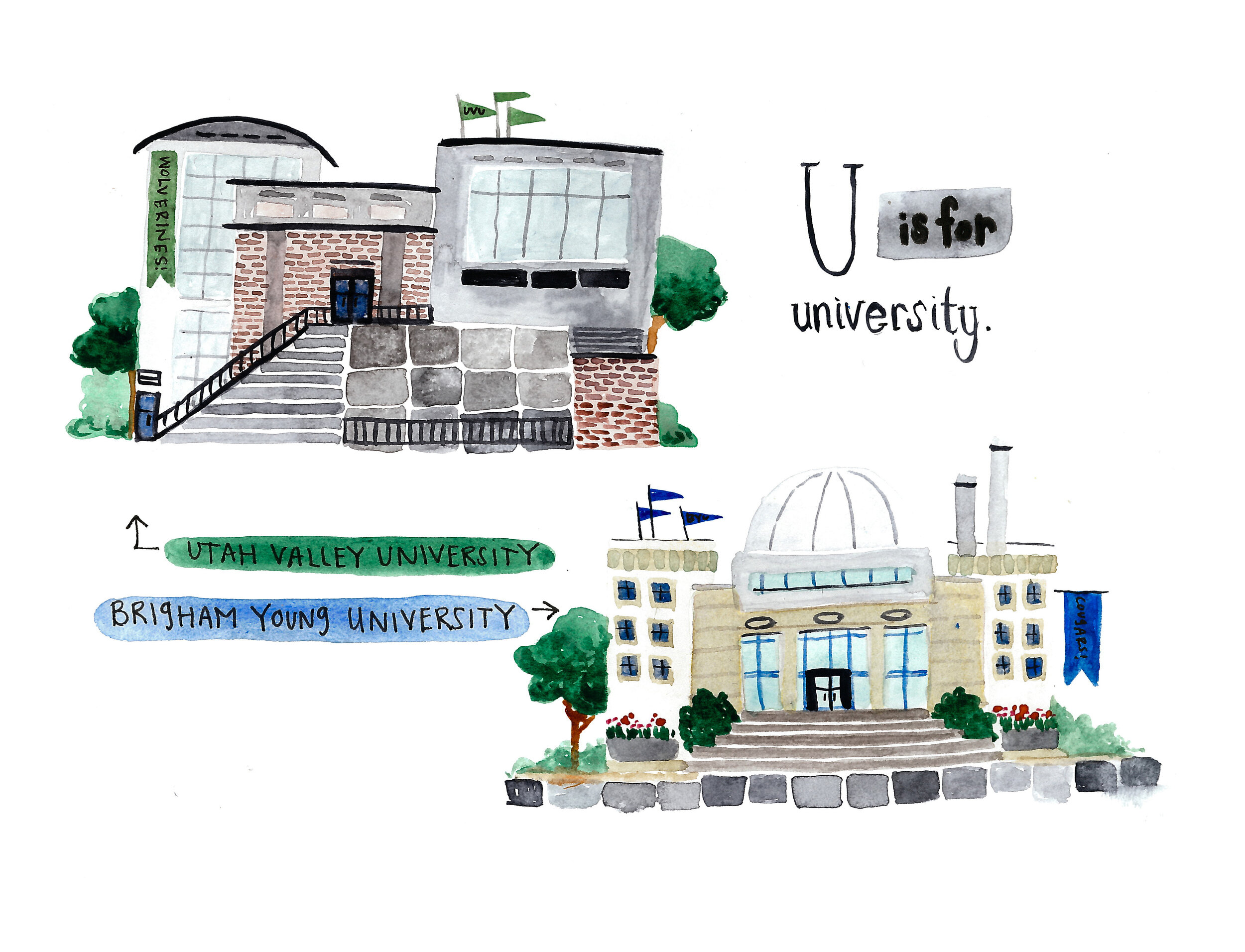
U is for university. The two schools we graduated from and specifically the buildings we spent most of our time in for our majors.
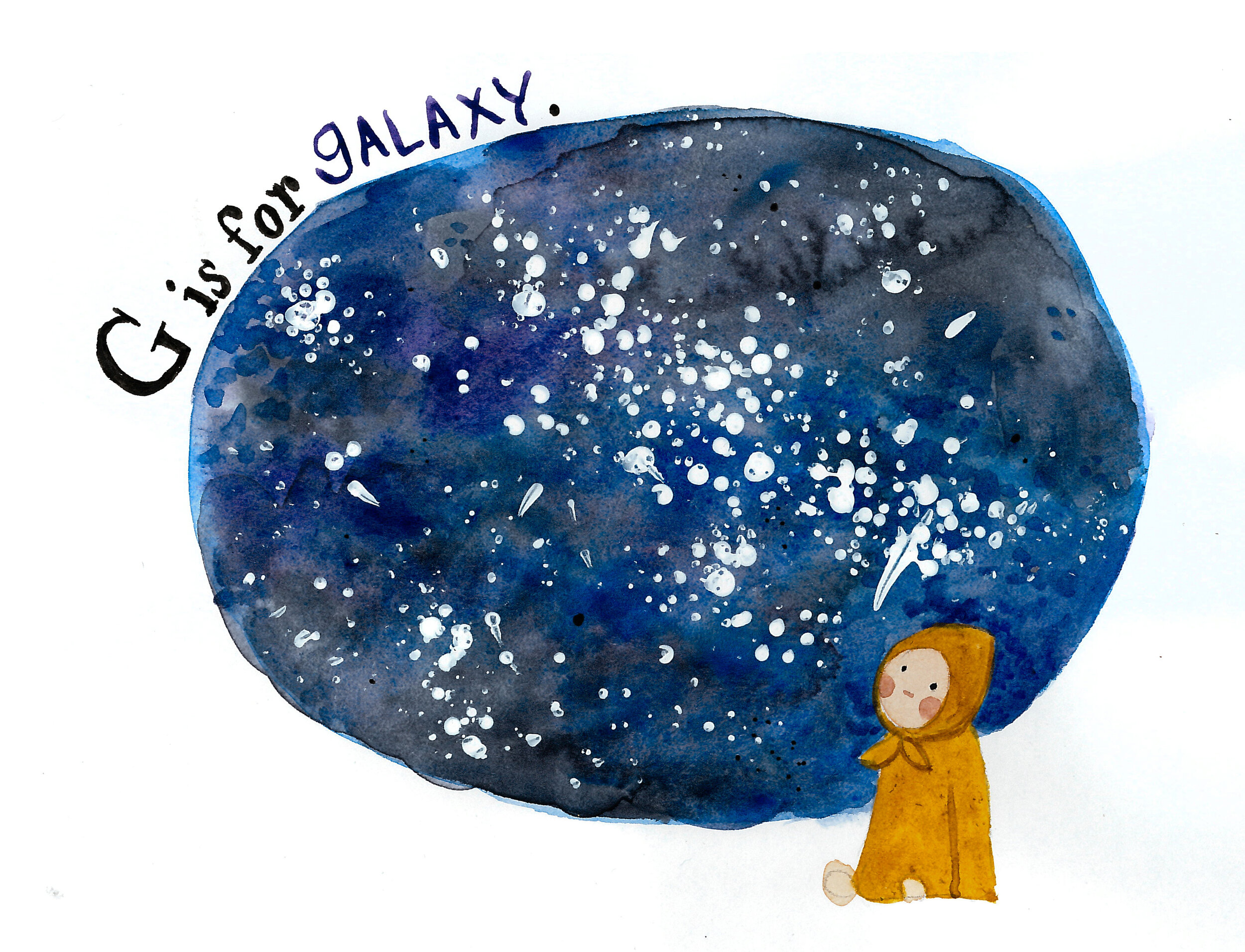
G is for galaxy. Staring up at the stars on summer nights is something that always makes me cry. I hope I can pass on that wonder and awe to my children.
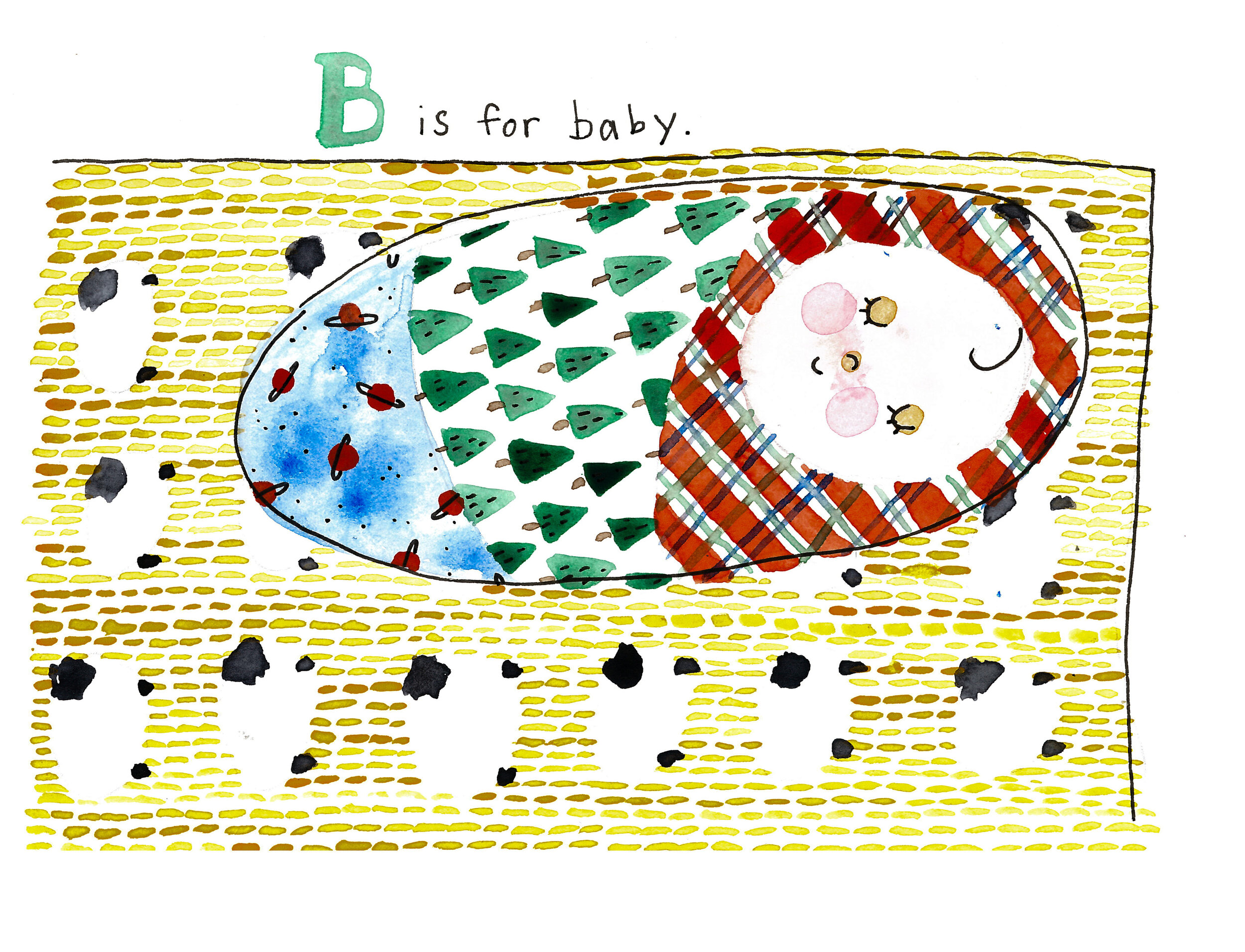
B is for baby. The yellow sheep blanket is a blanket he actually has that my mother-in-law made!
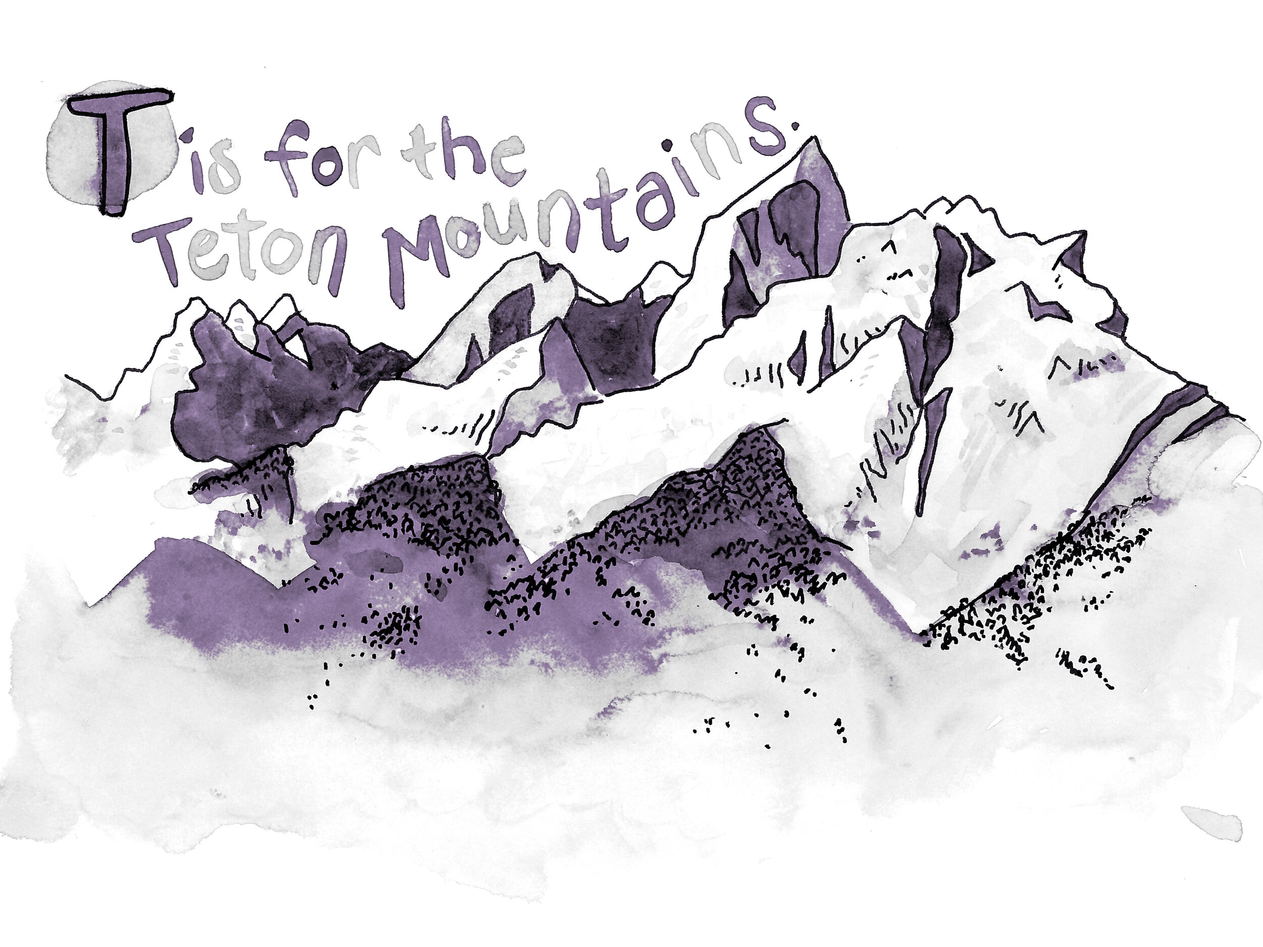
T is for the Teton Mountains. I grew up with a huge (HUGE) framed picture of the Tetons above our fireplace mantle my entire life. Jason and I met in Rexburg, Idaho, which has a distant view of the Tetons far off on the horizon. Then my dad moved to Yellowstone and we visited him often and got to spend even more time around these beautiful mountains.
Nearly every single page has a story, big or small, that can be told. That’s the most valuable part of making a custom book like this for a child or family member - it’s something so much more personal you could buy on a shelf. Though I will admit, I definitely got stuck just doing “X is for X-Ray” and there’s no story behind that. Just limited dictionary options.
SEE ALSO
MEMORIES FOR GRAMPS | how to put together a family book of memories


